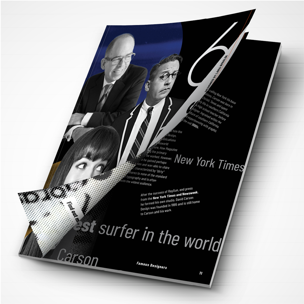
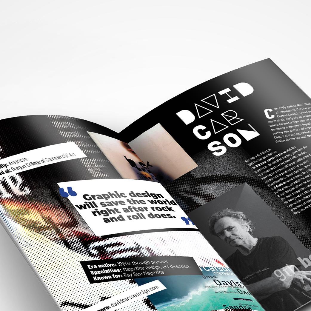
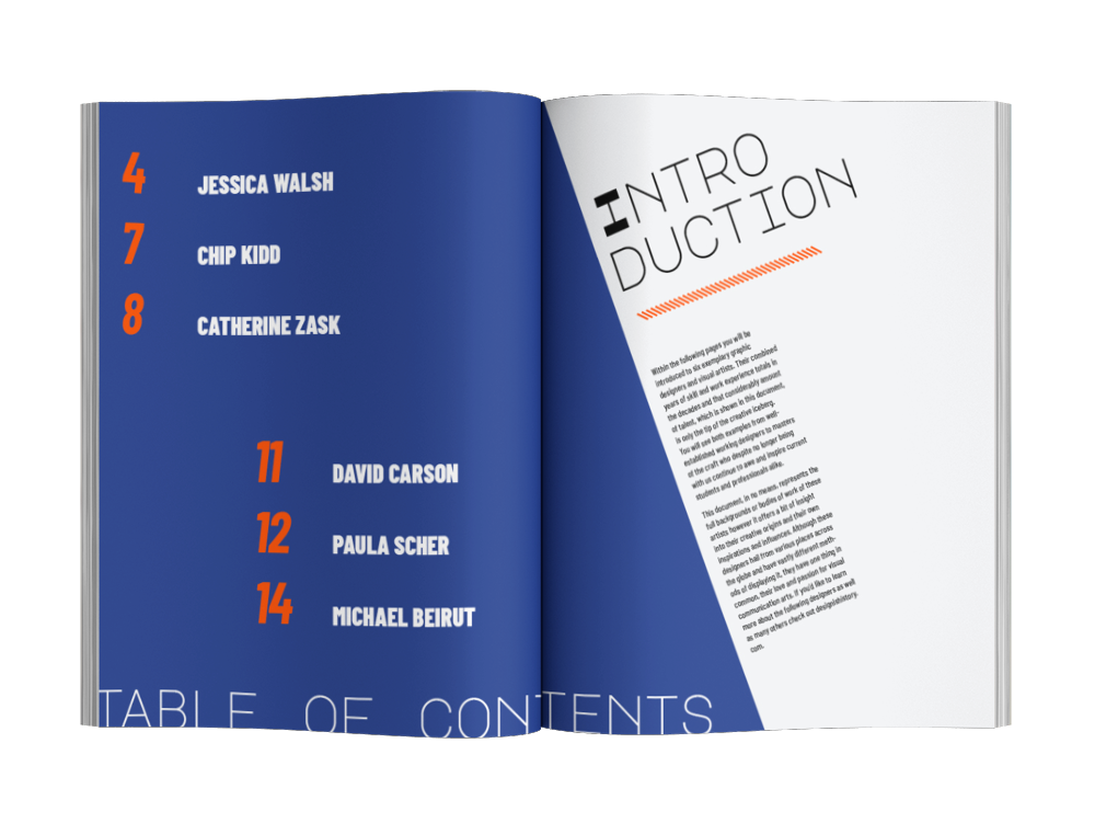
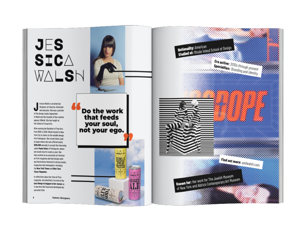
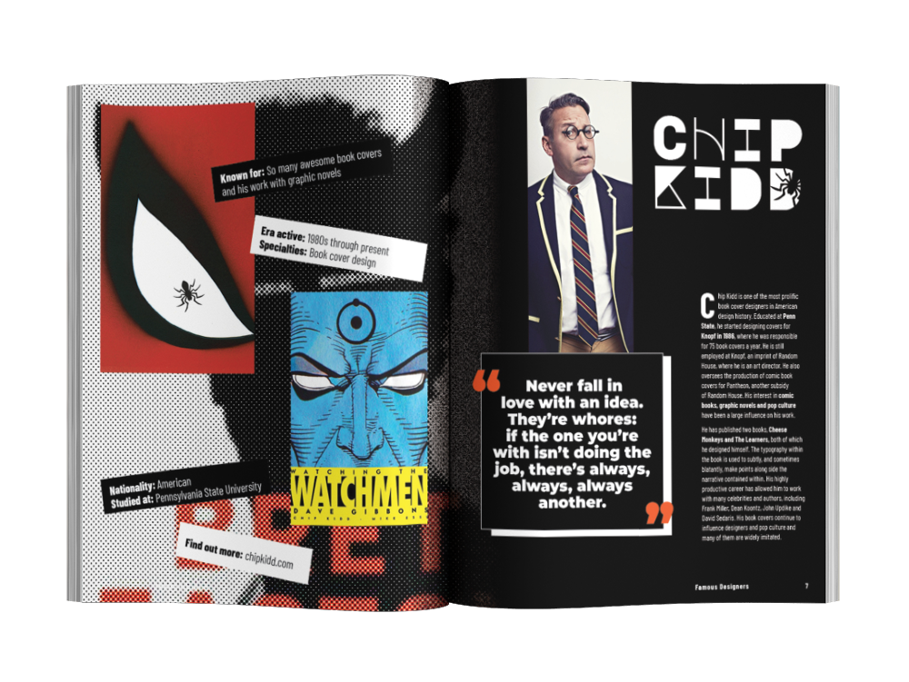
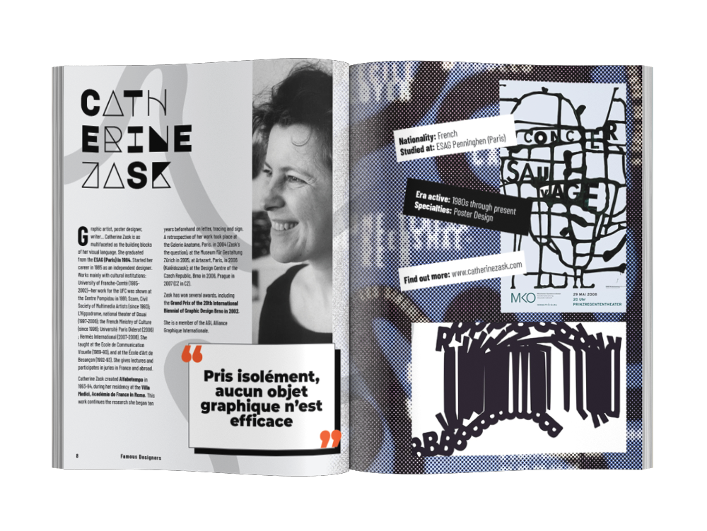
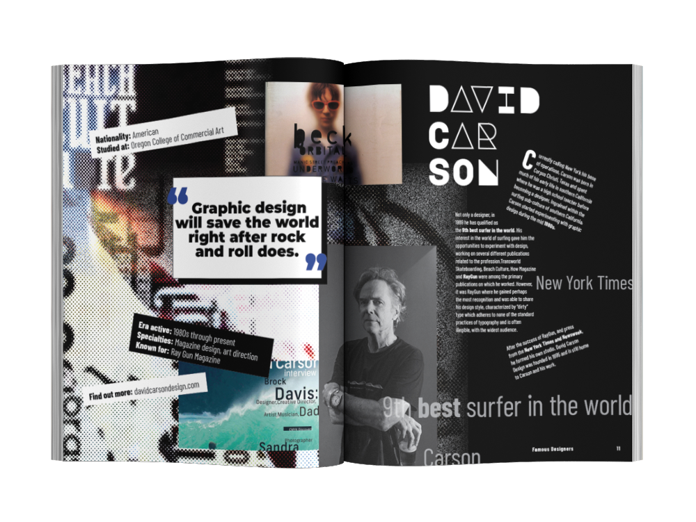
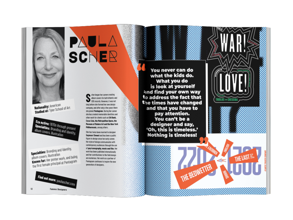
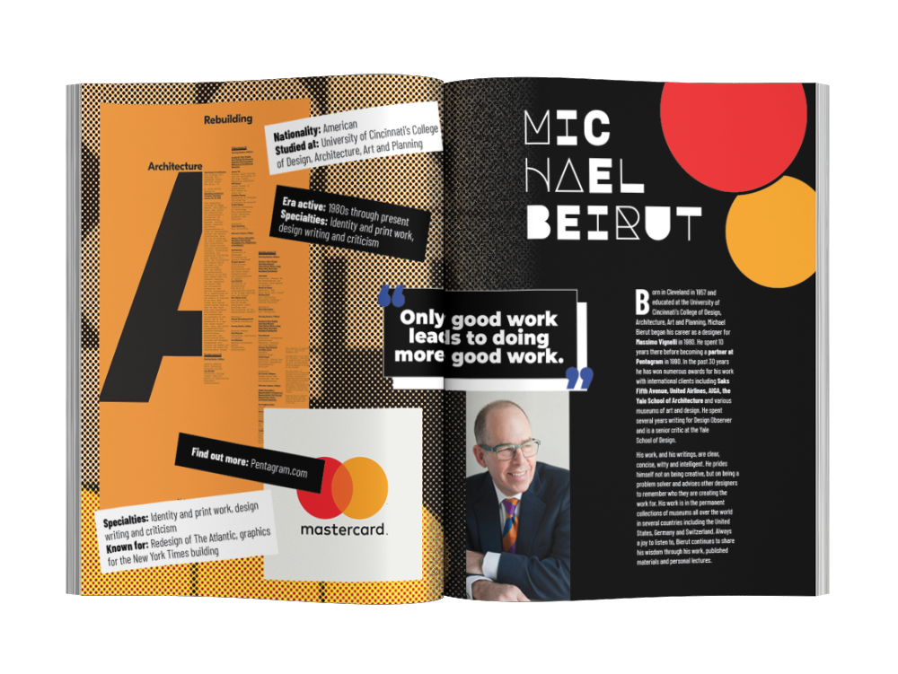
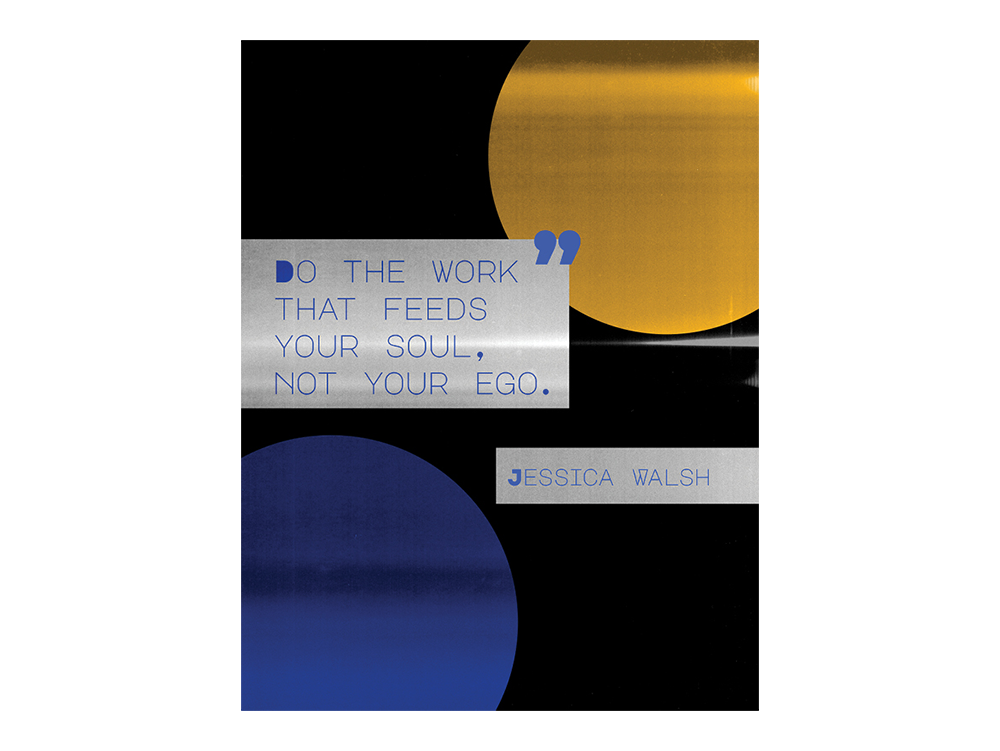
This project involved designing a zine about famous designers, with a strong focus on crafting a visually compelling editorial layout. Using Adobe InDesign, I applied principles of magazine design, including grid systems, typographic hierarchy, and dynamic spacing, to ensure a professional and polished look. The project required careful organization of pre-provided content. To maintain a high standard of design across all spreads, I implemented character and paragraph styles, allowing for consistent typography and seamless alignment throughout the publication.
As my first zine design, this project sparked my love for zine layouts and remains one of my favorite creations.
Tools
Photoshop, Illustrator, InDesign
Challenge
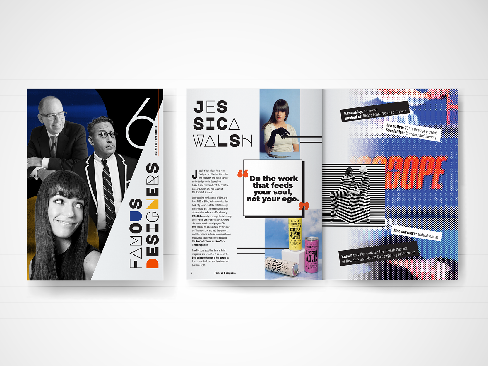
The challenge was to find a way to make the content both engaging and visually beautiful. With a lot of text to work with, I needed to strike a balance between readability and creative design, ensuring that the layout was not only informative but also fun and visually captivating for the reader.
Solution
To make the zine both engaging and visually appealing, I used a clear grid system to structure the content while allowing for flexibility in design. I focused on creating a strong typographic hierarchy, using varied fonts and sizes to highlight key information and guide the reader through the pages. I also incorporated elements like bold imagery and subtle graphic accents.
